poly-plague
> a coronavirus dashboard for cal poly
covid started halfway through my second year of college.
this was a hectic time and most people returned to their hometown while classes went online for the spring quarter.
frequent testing policies
many students returned to san luis obispo in the fall despite most classes remaining online.
as a precaution the university mandated that all students visiting campus submit a negative test and test regularly.
fall quarter of 2020 mostly required tests for those visiting campus.
resources were expanded in the winter quarter and testing was done twice a week.
by spring quarter the nasal swabs were replaced by saliva tests.
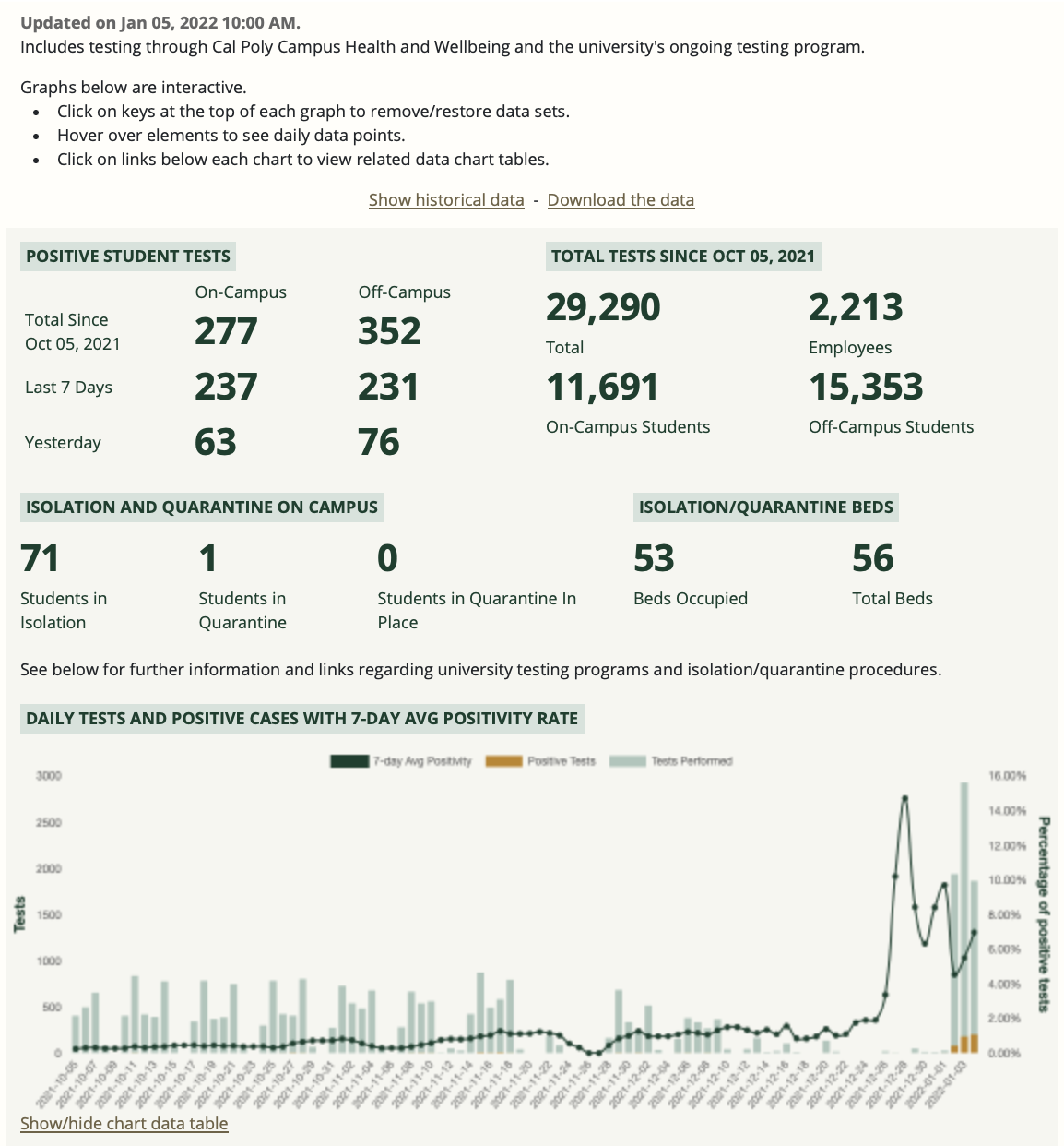
waiting for results days after testing always induced anxiety but viewing the combined results was interesting:

reacting to an omicron surge
the omicron variant spread widely over winter break in december 2021.
an immediate spike in positive cases followed as students returned to campus with each day breaking previous records.
this was extremely stressful as classes continued in-person.
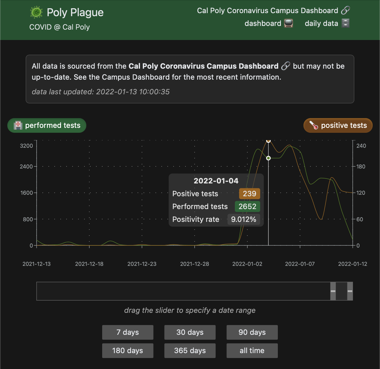
to cope with these stresses i made another dashboard to display data in a chart that could be adjusted:

slow deterioration of software
data for the chart was automatically downloaded from the campus dashboard and reformatted to make parsing easier.
an unexpected update to the source data structure broke the logic that reformatted this data days after the site was published.
having little will and energy to make a fix, the site remained broken.
but the data continued to be downloaded and committed to history.
testing requirements and the covid dashboard were removed at the start of the 2022 fall quarter.
this included all references to the data as far as i know.
however the last updates to the data can still be accessed from the commits.